Chart Configuration
Jeremy Wildfire
2022-12-14
Source:vignettes/ChartConfiguration.Rmd
ChartConfiguration.RmdChart Configuration Vignette
The {safetyGraphics} shiny app can be used to display a wide variety of charts. This vignette provides details about the charting process including step-by-step instructions for adding new charts and technical specifications, but first we need to talk about a 2nd package …
Introducing {safetyCharts}
While this is technically a vignette for {safetyGraphics}, the {safetyCharts} package is just as important here. The roles of the packages can be summarized in just a few words:
The {safetyGraphics} platform displays charts from {safetyCharts}.
This relationship is central to the technical framework for the safetyGraphics app. By itself, the safetyGraphics platform really doesn’t do much! In fact, none of the content on the Charts tab is actually found in the safetyGraphics package; it’s all imported from elsewhere! As you’ve probably guessed, the default charts live in the safetyCharts package. safetyCharts has over a dozen charts that are configured to work with {safetyGraphics}, but can also easily be used independently.
While {safetyGraphics} and {safetyCharts} are designed to work seamlessly together, users can also add charts from other packages. In fact, several charts in {safetyCharts} are just wrappers that load charts from other packages for use in {safetyGraphics}. The rest of this vignette provides a series of step-by-step examples detailing how this process works for different types of charts.
{safetyGraphics} Chart Components
To add a chart to safetyGraphics, two components are required:
- A Configuration Object
- A Chart Function
The configuration file captures metadata about the chart for use in the app and is typically saved as a YAML file. Several example configuration files are provided in the examples below, and YAML Configuration files for {safetyCharts} are saved here.
The chart function typically takes a list of settings and a list of data as inputs and returns a chart object ready to be displayed in the app. Details of charting functions vary somewhat for different chart types, as explained in the examples below.
A full technical specification of this chart configuration framework is provided in Appendix 1.
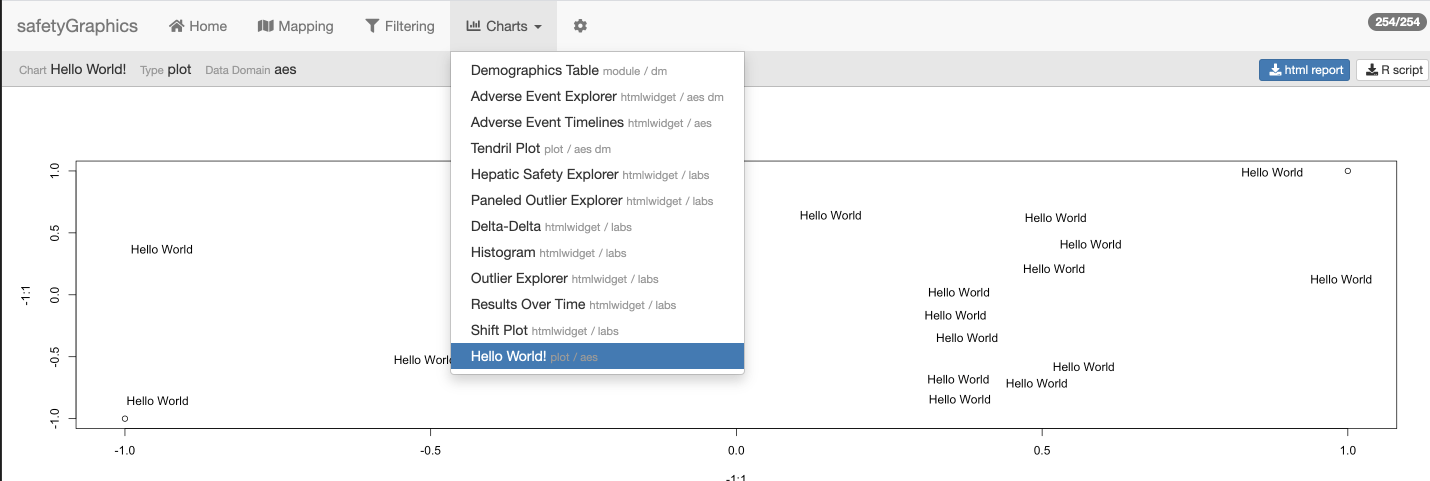
Example 1 - Hello World
Once you’ve created the configuration and chart functions, the chart can be added to the app via the charts parameter in safetyGraphicsApp(). Consider this simple “Hello World” example:
# Chart Function
helloWorld <- function(data, settings){
    plot(-1:1, -1:1)
    text(runif(20, -1,1),runif(20, -1,1),"Hello World")
}

# Chart Configuration
helloworld_chart<-list(
    env="safetyGraphics",
    name="HelloWorld",
    label="Hello World!",
    type="plot",
    domain="aes",
    workflow=list(
        main="helloWorld"
    )
)

safetyGraphicsApp(charts=list(helloworld_chart))
It’s also easy to add a custom chart to the default charts provided in {safetyCharts} using the makeChartConfig() function:
charts <- makeChartConfig(packages="safetyCharts") # or just makeChartConfig() since safetyCharts is included by default
charts$helloworld<-helloworld_chart
safetyGraphicsApp(charts=charts)
Here’s our Hello World the chart running in the app:
Example 2 - Static Outlier Explorer
Now let’s consider a more complex example that makes use of the data and settings provided in safetyGraphics. In this section, we use {ggplot2} to create a spaghetti plot for tracking outliers in lab data. First, consider the following code which creates a stand-alone plot for a single data set:
# Use sample clinical trial data sets from the {safetyData} package
library(safetyData)
library(ggplot2)
library(dplyr)
# Define data mapping using a format similar to a reactive safetyGraphics mapping
settings <- list(
id_col="USUBJID",
value_col="LBSTRESN",
measure_col="LBTEST",
studyday_col="LBDY"
)
# Define a plotting function that takes data and settings as inputs
spaghettiPlot <- function( data, settings ){
# define plot aes - note use of standard evaluation!
plot_aes <- aes(
x=.data[[settings$studyday_col]],
y=.data[[settings$value_col]],
group=.data[[settings$id_col]]
)
#create the plot
p<-ggplot(data = data, plot_aes) +
geom_path(alpha=0.15) +
facet_wrap(
settings$measure_col,
scales="free_y"
)
return(p)
}
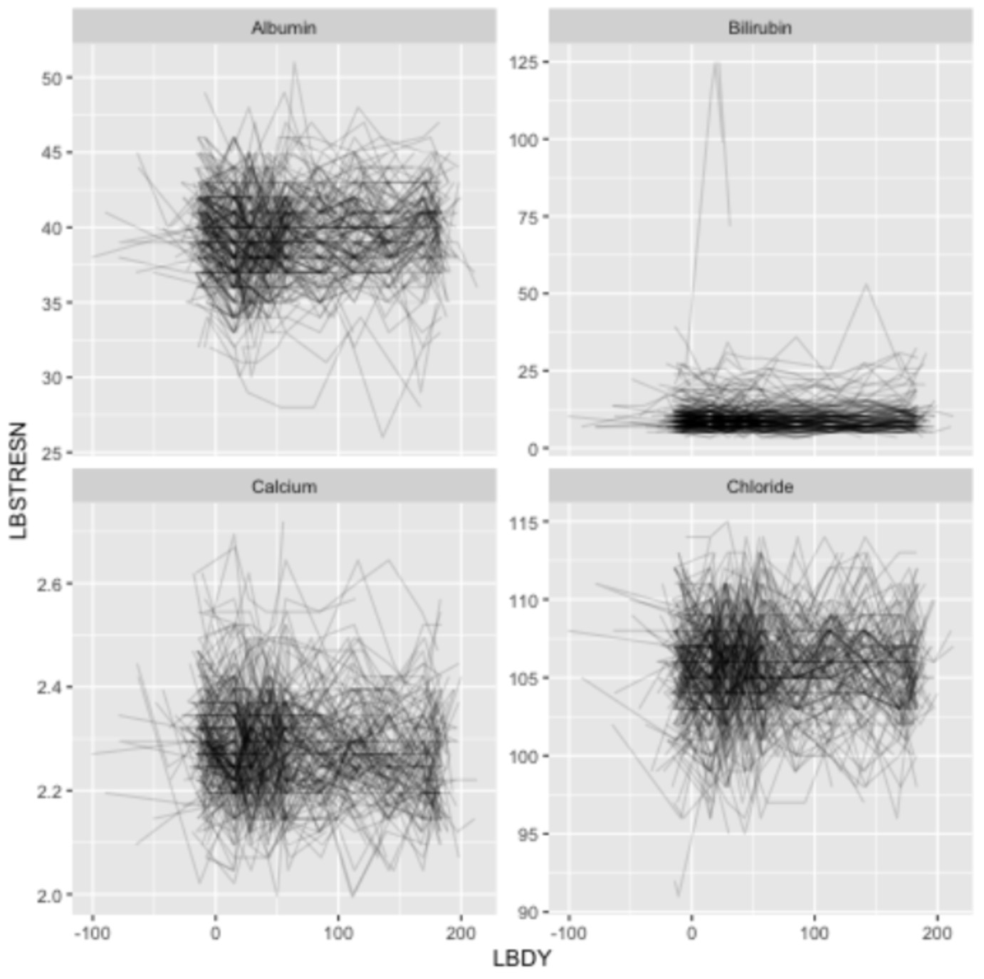
spaghettiPlot(
safetyData::sdtm_lb %>%
filter(LBTEST %in% c("Albumin","Bilirubin","Calcium","Chloride")),
settings
)Running the code above should create a plot with 4 panels:
With minor modifications, this chart can be added to the {safetyGraphics} shiny app, which allows us to create the chart with any mappings/data combination loaded in the app. The spaghettiPlot() function above is already written to work with safetyGraphics, so we just need to create the chart configuration object. This time we’ll capture the configuration in a YAML file.
env: safetyGraphics
label: Spaghetti Plot
name: spaghettiPlot
type: plot
domain:
    - labs
workflow:
    main: spaghettiPlot
links:
    safetyCharts: https://github.com/SafetyGraphics/safetycharts
With the charting function loaded in to our session and the configuration file saved in our working directory as spaghetti.yaml, we can add the chart to the app as follows:
library(yaml)
charts <- makeChartConfig()
charts$spaghetti<-prepareChart(read_yaml('spaghetti.yaml'))
safetyGraphicsApp(charts=charts)
Under the charts tab, you’ll see:
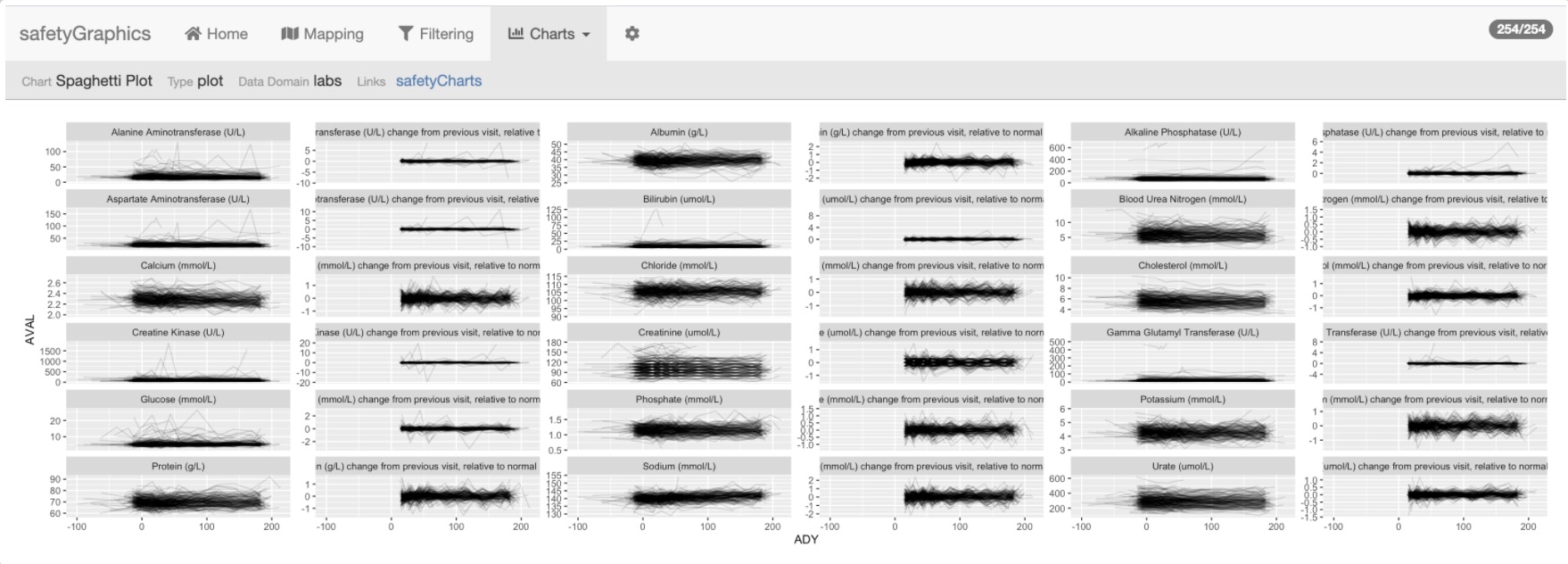
If you look closely at the spaghettiPlot() code above, you’ll noticed some details that make the chart work in the app:
- The chart function is written as a function taking
dataandsettingsas inputs. This is the expected parameterization for most charts in {safetyGraphics}. - The references to
settingsuse parameters that are defined on the mapping tab. Behind the scenes, these are defined in thesafetyGraphics::meta. - The
spaghettiPlotfunction is referenced in themainitem the YAMLworkflow. This tells the app which function to use to draw the chart. - We’re using the
.data[[]]pronoun in the chart function to access columns in the data based on the current settings. See these references for a lot more detail about functional programming in the tidyverse:- Using ggplot2 in packages
- Programming with dplyr
- Functional programming chapters in Advanced R These details allow users to dynamically define data attributes for any labs data set, allowing the chart to be reused across many different types of data.
This example is inspired by safetyCharts::safety_outlier_explorer - the charting function and yaml configuration file on are GitHub.
Example 3 - Shiny Module
{safetyGraphics} also supports defining charts as Shiny Modules. Once you’re familiar with modules, they are relatively straightforward to use with safetyGraphics.
Let’s take a look at a simple module that extends the functionality of the static chart from the example above. Once again, this example is based upon safetyCharts, and you can see the code and config on GitHub.
The config object for a module differs from a static chart is that the workflow section of the YAML file must specify ui and server functions instead of a main charting function. This example defines a simple UI function that allows users to select which lab measurements should be included in the spaghetti plot from example 1:
safetyOutlierExplorer_ui <- function(id) {
    ns <- NS(id)
    sidebar<-sidebarPanel(
        selectizeInput(
            ns("measures"),
            "Select Measures",
            multiple=TRUE,
            choices=c("")
        )
    )
    main<-mainPanel(plotOutput(ns("outlierExplorer")))
    ui<-fluidPage(
        sidebarLayout(
            sidebar,
            main,
            position = c("right"),
            fluid=TRUE
        )
    )
    return(ui)
}
Next we define a server function that populates the control for selecting measurements and then draws the plot using safetyCharts::safety_outlier_explorer() charting function - which is based on the spaghetti() function! Note that the server function takes a single reactive params object containing the data (params$data) and settings (param$settings) as input.
safetyOutlierExplorer_server <- function(input, output, session, params) {

    ns <- session$ns
    # Populate control with measures and select all by default
    observe({
        measure_col <- params()$settings$measure_col
        measures <- unique(params()$data[[measure_col]])
        updateSelectizeInput(
            session,
            "measures",
            choices = measures,
            selected = measures
        )
    })

    # customize selected measures based on input
    settingsR <- reactive({
        settings <- params()$settings
        settings$measure_values <- input$measures
        return(settings)
    })

    #draw the chart
    output$outlierExplorer <- renderPlot({safety_outlier_explorer(params()$data, settingsR())})
}
Finally, the YAML configuration file looks like this - just the workflow and label changes from Example 1:
env: safetyGraphics
label: Outlier Explorer - Module
name: outlierExplorerMod
type: module
package: safetyCharts
domain:
    - labs
workflow:
    ui: safetyOutlierExplorer_ui
    server: safetyOutlierExplorer_server
links:
    safetyCharts: https://github.com/SafetyGraphics/safetycharts
Initializing the app as usual by adding it to the chart list: charts$outlierMod<-prepareChart(read_yaml('outlierMod.yaml'))
Unselecting a few measures gives the following display: 
Example 4 - htmlwidgets and init functions
You can also add custom htmlwidgets to safetyGraphics. In fact, many of the default charts imported from safetyCharts are javascript libraries that are imported as htmlwidgets. Like shiny modules, htmlwidgets are relatively simple to use once you are familiar with the basics.
The biggest differences between widgets and other charts in safetyGraphics are:
- The widget must be contained in a package, which must be specified in the YAML file.
- The widget expects a
widgetitem giving the name of the widget in the YAML workflow. - By default, the data and settings for a widget are passed in a list (
list(data=data, settings=settings)) to thexparameter inhtmlwidget::createWidget.
Items 1 and 2 above are simple enough, but #3 is likely to create problems unless the widget is designed specifically for usage with safetyGraphics. That is, if the widget isn’t expecting x$settings to be a list that it uses to configure the chart, it probably isn’t going to work as expected.
Fortunately, there’s a workaround built in to safetyGraphics in the form of init workflow functions. Init functions run before the chart is drawn, and can be used to create custom parameterizations. The init function should take data and settings as inputs and return params which should be a list which is then provided to the chart (see the appendix for more details). The init function for the the interactive AE Explorer is a good example. It starts by merging demographics and adverse event data and then proceeds to create a customized settings object to match the configuration requirements of the javascript chart renderer. This init function is then saved under workflow$init in the chart config object.
The rest of the chart configuration YAML is similar to the examples above, and the chart is once again by passing the chart config object to safetyGraphicsApp()
Example 5 - Adding a Chart in a New Data Domain
All of our examples so far have been focused on creating charts in our 3 default data domains (labs, adverse events and demographics), but there is no requirement that limits charts to these three data types. The data domains in the app are determined by a meta data frame that defines the columns and fields used in safetyGraphics charts, and customizing meta allows us to create charts for any desired data domains.
Generally speaking there are 3 steps to add a chart in a new domain:
- Create Metadata for a new data domain.
- Define a chart using the new domain - like the examples above
- Load data for the new domain
Consider the following example, that modifies a chart from the labs domain for use on ECG data:
adeg <- readr::read_csv("https://physionet.org/files/ecgcipa/1.0.0/adeg.csv?download")

ecg_meta <-tibble::tribble(
    ~text_key, ~domain,                      ~label,                               ~description, ~standard_adam, ~standard_sdtm,
    "id_col",   "custom_ecg",                 "ID column", "Unique subject identifier variable name.",      "USUBJID",      "USUBJID",
    "value_col",   "custom_ecg",              "Value column",                 "QT result variable name.",         "AVAL",     "EGSTRESN",
    "measure_col",   "custom_ecg",            "Measure column",                 "QT measure variable name",        "PARAM",       "EGTEST",
    "studyday_col",   "custom_ecg",          "Study Day column",                  "Visit day variable name",          "ADY",         "EGDY",
    "visit_col",   "custom_ecg",              "Visit column",                      "Visit variable name",         "ATPT",        "EGTPT",
    "visitn_col",   "custom_ecg",       "Visit number column",               "Visit number variable name",        "ATPTN",             NA,
    "period_col",   "custom_ecg",             "Period column",                     "Period variable name",      "APERIOD",             NA,
    "unit_col",   "custom_ecg",               "Unit column",            "Unit of measure variable name",        "AVALU",     "EGSTRESU"
) %>% mutate(
    col_key = text_key,
    type="column"
)

qtOutliers<-prepare_chart(read_yaml('https://raw.githubusercontent.com/SafetyGraphics/safetyCharts/dev/inst/config/safetyOutlierExplorer.yaml') )
qtOutliers$label <- "QT Outlier explorer"
qtOutliers$domain <- "custom_ecg"
qtOutliers$meta <- ecg_meta

safetyGraphicsApp(
    domainData=list(custom_ecg=adeg),
    charts=list(qtOutliers)
)
As of safetyGraphics v2.1, metadata can be saved directly to the chart object using chart$meta as shown in the example above.
Alternatively, metadata can be saved as a data object in the chart$package namespace. Chart-specific metadata should be saved as meta_{chart$name} while domain-level metadata should be named meta_{chart$domain}. It’s fine to use a combination of these approaches as appropriate for your chart. See ?safetyGraphics::makeMeta for more detail.
Appendix #1 - Chart Framework Technical Specifications
Configuration Overview
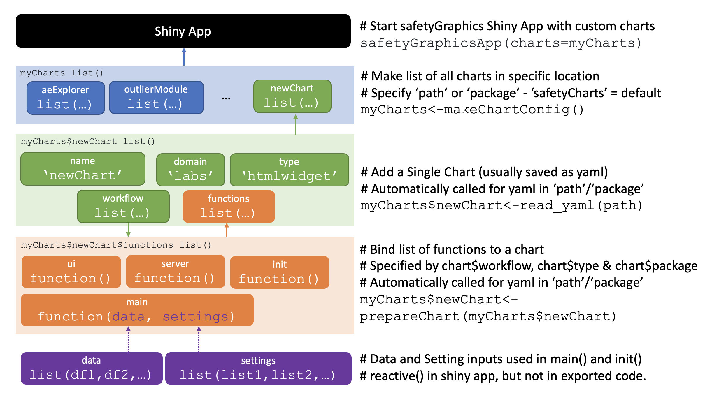
The diagram above summarizes the various components of the safetyGraphics charting framework:
- The
safetyGraphicsApp()function allows users to specify which charts to include in the shiny app via thechartsparameter, which expects alistof charts. - Each item in
chartsis itself defined as alistthat provides configuration details for a single chart. These configuration lists have several required parameters, which are described in the technical specification below. - Configuration lists are typically saved as YAML files, but can be also be loaded directly as list objects as shown in the Hello World example above.
- Needed functions are bound to the chart object via the prepareChart() function. See the documentation for
chart$functionsbelow for full details.
Chart Specification
Each item in the charts list should be a list() with the following parameters:
-
env: Environment for the chart. Must be set to “safetyGraphics” or the chart is dropped. Type: character. Required -
name: Name of the chart. Type: character. Required -
type:: Type of chart. Valid options are: “plot”,“htmlwidget”,“html”,“table” and “module”. Type: character. Required -
label: A short description of the chart. chart$name is used if not provided. Type: character. Optional -
domain: The data domain(s) used in the chart. Type: character. Required -
package: The package where the {htmlwidget} is saved. Type: character. Required whenchart$typeis “htmlwidget” -
meta: Table of chart-specific metadata. Metadata can also be saved as{package}::meta_{chart}or{package::meta_{domain}. See?safetyGraphics::makeMetafor more detail. -
order: Order in which to display the chart. If order is a negative number, the chart is dropped. Defaults to 999999. Type: Integer. Optional -
links: Named list of link names/urls to be shown in the chart header. Type: list of character. Optional -
path: Full path of the YAML file. Auto-generated bymakeChartConfig()Type: character optional -
workflow: Names of functions used to create the chart. Should be loaded in global environment or included inchart$packagebefore callingprepareChart(). Supported parameters are listed below. Type: list of character. Required-
workflow$main: name of the function to draw the chart. The function should takedataandsettingsparameters unless the input parameters are customized by aninitfunction. Required, unlesschart$typeis “htmlwidget” or “module”) -
workflow$init: name of initialization function that runs before chart is drawn via themainfunction. Should takedataandsettingsas input and return a list of parameters accepted by themain` function. Optional -
workflow$widget: name or widget saved inchart$packageto be passed tohtmlwidgets::createWidgetRequired whenchart$typeis “htmlwidget” -
workflow$uiandworkflow$server: names of functions to render shiny ui and server. Automatically generated inprepareChart()unlesschart$typeis “module”. Required whenchart$typeis ‘module’
-
-
functions: a list of functions used to create the chart. Typically generated at runtime byprepareChart()using information inchart$workflow,chart$typeandchart$package. Not recommended to generate manually. Type: list of functions. Required
Default Technical workflow
This appendix describe the technical process used to render a chart when safetyGraphicsApp() is called with the default parameters.
-
safetyGraphicsApp()is called withchartsandchartSettingsPathas NULL (the default). -
app_startupis called, which then immediately callsmakeChartConfig(). -
makeChartConfig()looks for charts in the safetyCharts package (the default) since no path was specified. The function looks for the package in all current.libPaths()and then looks in theinst/configfolder once the package is found. -
makeChartConfigloads YAML configuration files in the specified directories and saves them to a list.nameandpathparameters are added. -
makeChartConfigcallsprepareChartfor each chart configuration.prepareChartsets default values fororder,nameandexport, and then binds relevant functions to achart$functionslist based on the chart’stype,workflowandpackage. - That list of charts is then returned to
app_startup()which runs a few actions on each chart:- If
chart$functionsis missing,prepareChartis called (not relevant in the default workflow, but useful for adding custom charts) - If
chart$orderis negative, the chart is dropped with a message. - If
chart$envis not “safetyGraphics”, the chart is dropped with a message. - If
chart$domainshas elements not found in thedataDomainspassed to `app_startup(), the chart is dropped with a message. -
chartsare re-ordered based onchart$order
- If
-
app_startuppasses the updated list of charts tomakeMetaassuming nometaobject was provided.makeMetacombines metadata from all charts in to a single data.frame. Charts can save metadata aschart.meta,{package}::meta_{chart}or{package}::meta_{domain}. -
app_startupreturns the list of charts and associated metadata tosafetyGraphicsAppwhich then then passes them along tosafetyGraphicsServeras thechartsparameter. -
safetyGraphicsServerthen creates modules for each chart. First,UIsare created viachartsNav()which then calls:-
makeChartSummaryto create the chart header with links and metadata and … -
ChartsTabUIwhich then callschart$functions$uito create the proper UI element based onchart$type.
-
- Next,
safetyGraphicsServerdraws the charts usingchartsTab()which:- Creates a reactive
paramsobject containing mappings and data usingmakeChartParams()which:- Subsets
domainDatabased onchart$domain - Calls
charts$functions$initif provided - Does custom formatting for
chart$typeof “htmlwidget”
- Subsets
- Chart is drawn using
chart$functions$serverandchart$functions$main - Button to download R script is added to header. Script is created by
makeChartExport() - Button to download html report is added to header unless type=“module”. Report template is at “inst/reports/safetyGraphicsReport.Rmd”
- Creates a reactive
- Finally,
safetyGraphicsServerpasses the charts tosettingsTab, which uses them to help populate thechartsandcodesubtabs.